Painting the Stars描绘群星
Posted February 07, 2020 by dgbaumgart in Art
Translated at February 09 by jn_xyp
于2020年02月09日翻译,译者:jn_xyp
注意,文中出现的聚变光源和日冕活动二词均为暂定翻译,不能代表汉化组的意见。
本文中出现的美术相关专业名词可能存在翻译错误,请各位不吝赐教。
摘要
本文主要介绍了在后续版本中可能加入的聚变光源物品的艺术设计理念和流程。聚变光源是一种可部署在殖民星球轨道上的物品,利用核聚变为星球提供生物生存所必需的光和热,用以解决无恒星星系的光照不足问题。聚变光源的来源可能是星区探险。除此以外,其它基于人之领时代超科技的巨型结构也可能在后续版本加入游戏。本文后半部分介绍了作者利用实体绘画弥补数字绘画纹理不足问题的尝试,并介绍了作者常用的笔刷和喷枪,以及相关绘画技巧。
You may have seen this post by Alex come up on your TriPad™ last month – click to visit the lovely original video.
在上个月,你也许已经在你的速子Pad™上看到了Alex发的这个帖子(注:见文末)
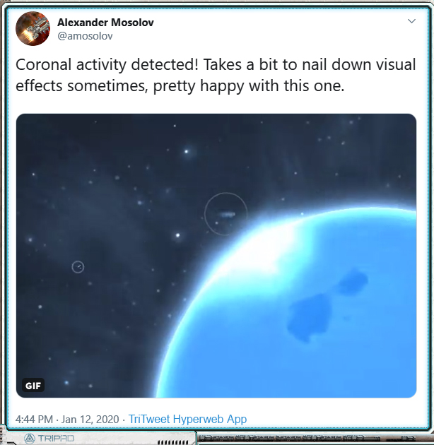
See also a related TriMedia Experience here.
另一条由速子传媒带来的精彩视频(注:见文末)
Clearly, something’s up with at least one star or Domain-era tech definitely-safe star-like object. I’m not here to say what’s precisely what or how you players will inevitably try (and succeed) to exploit the mechanics of it, but more to speak about the artistic method to in portraying said star-adjacent objects and/or activities.
Well. I’ll have to spoil a little bit to explain how I’m approaching artistic these problems, so buckle up and be on alert for a COMSEC lockdown. This is the deep-dive digital painting post the Hegemony doesn’t want you to know about!
显然,这些视频展现了有一颗恒星的活动,以及人之领时代的某些仿星科技产物。在本文中,我并不会详细讨论有关于玩家如何去尝试(并成功地)利用这些机制的方法,而是着重于艺术方面的技法。主要是关于如何描绘前面提到的恒星活动以及临近物体的方法。
当然,在描述我如何解决这些美术上的问题时,不可避免地会产生一些剧透。所以,请系好安全带并随时警惕霸主安全部门的锁定————这是霸主不想让您了解的硬核数字绘画帖子!
The Fusion Lamp 聚变光源

[Is/Are] your planetary [colonists/workforce/biomedium] looking a little gloomy? Do you feel like you’re in the dark compared to more popular worlds up-Gate? Fabrique Orbitale is here to show you the light, because “The Sun Never Sets”™ with the Fabrique Orbitale Orbital Fusion Lamp™.
您星球上的 殖民者/劳工/生物体 最近感到有些郁郁寡欢吗?与那些靠近星门的繁荣世界相比,您是否感到自己的星球暗淡无光?来自Fabrique Orbitale的 “日不落”™牌 轨道聚变光源™,为您的世界带来希望的曙光。
We wanted to explore the mechanical possibilities within the theme of lost Domain hypertech and megaprojects, so we came up with a list of problems the player may face in the embattled Persean Sector and then a list of hypertech and megaprojects that could provide Perfectly Safe and definitely Not Problem Creating solutions to these problems. One problem a player may find is that the star in a newly settled system is inadequate. This is where your Orbital Fusion Lamp comes in- it’s basically a big fusion generator facing your planet, providing life-giving light and heat well within the Domain radiological safety parameters (Frontier-rated only).
在人之领时代结束后,大量超级科技和巨型工程四下流落。在这一背景下,为了探索更多游戏机制的可能性,我们罗列了玩家在危机四伏的英仙座星区探索时可能遇到的问题,并基于一些绝对可靠稳的一批(迫真)的超先进技术,提出了一系列解决方案。针对新殖民星球日照不足这一问题,轨道聚变光源会是合适的选择。简单地来说,聚变光源就是一个朝向殖民星球的大型聚变反应器,提供可供生命生存的光和热,并且完全符合人之领时代的辐射安全参数标准(边疆限定)。
Let’s talk assets. This is an object the player may find and pick up during exploration, so it needs a cargo icon. It is an object in space the player may interact with, so it needs an interaction illustration. The cargo icon looks not unlike the image above and to the right, and I’m not going to talk about drawing it right now.
The illustration, the digital painting? That’s going to take some thought, which I’ll share with you.
让我们来说下聚变光源所对应的货舱物品。因为玩家可以在探索星区时捡到一个聚变炉,所以得画一个货物图标。又因为聚变炉是一个可以和玩家交互的空间实体,所以还要画一幅互动界面的插图。货物图标大概就长上面那样,这里先不讨论。
而接下来,对于数字绘制的插图,我将会与你分享一些我的思路。
Here’s a first take:
以下是第一次尝试:
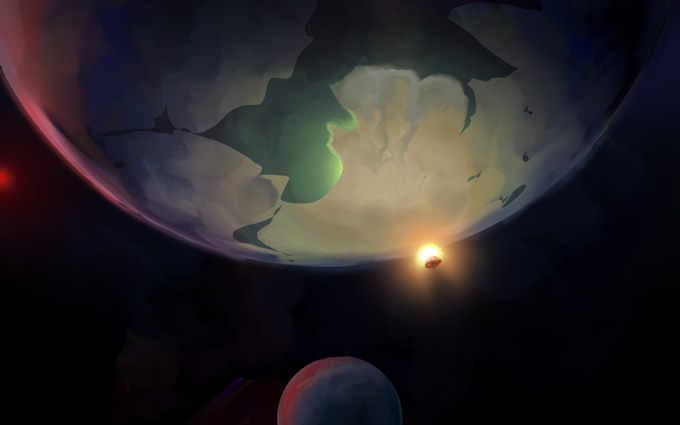
This has a lot going for it, and it tells a nice story. You’ve got a dim red dwarf star with some cold planets, particularly one perhaps tundra or terran-eccentric class world as the primary subject. Great candidate for a Fusion Lamp, let’s put one right there in a nice warm yellow to evoke the comfort of home. It illuminates only the one planet, not the moon (vs the star) to show its small scale. It’s drawn on top of the planet, over rather than behind the horizon, to reverse the expected sunset/sunrise order of silhouetting. You can see that this false-star is very much smaller than the planet. I love this ability in science fiction to take a small, normal thing and make it very wrong to demonstrate the scifi aspects of the setting.
这张图包含了不少细节,并且很好地传达了要表达的信息。图上有一颗暗淡的红矮星,以及两颗冷寂的星球。画面的主体,是一颗苔原或类地种类的行星,很适合作为聚变光源的应用对象。聚变炉发出温暖的黄色光芒,给人以家的舒适感。与恒星相比,其发出的光芒仅能照亮行星本身,照不亮旁边的卫星,以此凸显聚变炉的渺小。聚变炉出现在行星上方,而不是在地平线上,照亮了原本因为日出/日落周期而陷入黑暗的星球表面。你可以很明显地看出,这颗假的恒星其实要比行星小得多。我很喜欢这种在科幻作品中常用的手段:通过把一个渺小而寻常的东西(错误地)夸张化,以展现所对应的科幻概念。
Cool story, right? However it’s an extremely specific story, and by the time I got to this point I realized that I’m not drawing a Fusion Lamp for one particular planet, I’m drawing a fusion lamp for every planet. To be fair, these illustrations are about setting a mood rather than precise representation, so they can get away with suggesting particulars that don’t apply to the given situation. Still, there’s a balance to be met, and I think this tipped a bit far toward the particular.
New layer, let’s paint it again!
Let’s get closer, let’s focus on the fusion lamp itself:
这个设定还可以吧?但是,我这时才意识到,我并不是在为某一个特定的星球画聚变炉,而是为每一颗行星的聚变炉画插图。这幅图显得有些太具体了。虽然说这一类概念图一般不是为了精确地传达信息,更多的是来渲染气氛,因此可以容许出现一些不符合现状的细节。尽管如此,在这方面仍然要把握一个度,而这张图就太偏向于特定的情况了。
新建图层,再画一遍!
这次,让我们放大一些,把注意力放在聚变光源本身上面:
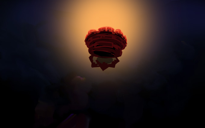
I do like how this evokes some kind of glowing deep-sea jellyfish; that’s just the sort of weird parallel that’s fun to stumble into. However it was at this point I realized that I was simply reproducing the cargo icon, just a bit larger and with different lighting. This is 1. kinda boring because it doesn’t even provide a literal different angle on the subject, and 2. tedious because I have to get this image to match the cargo icon exactly or else I’ll feel like I’m being sloppy. Nope, nope. Back up again.
The picture has to give the viewer something they haven’t already seen in the icon, and it’s got to be about a mood focused on the Fusion Lamp itself, not the setting around it.
Zoom in more! Get wild!
我挺喜欢这次所画聚变炉的外观,让人联想起某种发光的深海水母,可以说是很有趣的无端联想了。然而,此时我才意识到,我只是单纯地把聚变炉的物品图标又画了一遍,只不过是画大了一点,并且加了点不同的光效而已。这么做的缺点有二:1.很无聊,这幅新的画甚至角度和之前都一模一样; 2.强迫症发作,因为我会强迫让画上的细节和之前的图标一模一样,否则自己就会感觉在偷懒。不行不行,再来一张。
新画的插图应当给玩家展示他们还没见过的,与货舱图标不同的内容,并且应该更专注于表现聚变光源本身,而不是周边的场景。
并且,要放大,放大,再放大!
Here’s take #3:
以下是第三次尝试:
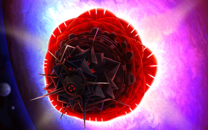
Yeah! Now I’m feeling it. And it feels hot. Like a burning bright rose blasting its light at a miserable ice-ball which is totally overwhelmed by the fiery fusion embrace of Domain-era hypertech!
不错!现在我感受到聚变光源炙热的感觉了。好似一朵绽放在冰冷星球上的火玫瑰,用人之领时代的超科技核融合之火将可怜的冰球淹没!
The angle is slightly different, so it doesn’t have to match the cargo icon so exactly. Plus, maybe when this thing is deployed it alters its configuration a bit? Yeah, good. OK. And maybe I can still tweak the image a bit; whatever, this sells it, and it’s displayed in-game at 480×300 anyway so if the details don’t line up, no one notices until I point it out like I am now.
这张图的角度和上一张略有不同,因此在细节上不一定要和货舱图标保持完全一致。更何况,在聚变炉被实际安装到位后,其形态也可以略微发生改变。对,是这样的,也许我还可以再调整一下...不管了,就这样了,反正在游戏里这张图的大小也只有480×300像素,所以除非我主动指出,没人会注意到细节上的不同。
Moving along, the blue in the moons/other planets suggests coolness to contrast with the warm colour glowing out of the Fusion Lamp body itself, though its output is- well, it’s unclear exactly what colour its supposed to be because it’s kind of a weird gradient; very bright, maybe a little artificial. It’s not quite literal. It’s open to interpretation.
I feel like this is hitting the notes I’ve intended.
除此以外,图上其它星球和卫星呈现出代表低温的蓝色,与聚变光源本身放出的暖光形成对比。虽然现在发光的颜色渐变看起来有点奇怪,但其实我也不清楚光源应该是什么颜色。光源的色彩应当非常明亮,并带有人造的感觉,很难用语言形容。这一部分留到以后再进行解释。
我觉得目前的样子很符合我的预期。
What was really a bit of a breakthrough for me came when I started painting the ‘flames’ coming out of the Lamp:
对于我来说,这幅图上真正的突破,在于我开始绘制由光源散发出的“火焰”:
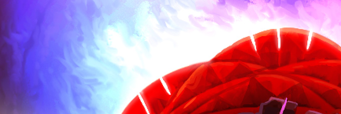
It gives a living, billowing, fire-like texture to what might, in a 3D render, be a flat gradient. I think this is rather key to giving the Lamp some personality. Which brings me to not just an important tangent, but the main subject I wanted to discuss!
Let’s talk about brushes.
这种在平面上翻腾着的类火焰渐变,表现出了类似3D渲染的逼真效果。我认为,这正是赋予聚变光源灵魂的关键。由此,我终于可以引出本文的主题:笔刷。
Paint Brushes 油画刷
I’ve recently taken up physical, real-life painting after leaving it behind for, oh, a dozen years or so. Art school burnout will do that to you.
在艺术学校把我的热情燃烧殆尽后,我将现实中的绘画搁置了12年之久。但最近,我终于又开始重操旧业了。
Also: I can afford it now. Looking back, a dozen $30 tubes of paint is not something an art student can feel comfortable experimenting with unless money truly is no concern. It’s sobering to consider how conservative this made my artistic output, in retrospect. I only felt really free using ink, watercolour, and gauche because they’re cheap media. Digital painting has that advantage, too. Kind of. side-eye at Adobe
另一个原因是:我现在承担得起现实中的绘画开销了。回望当年,除非家里有矿,否则艺术生一般承担不起一打每管价值30刀的油画颜料。现在想想,经济条件对我创作的限制简直令人震惊。只有在用水性笔、水彩和水粉这些相对便宜的媒介进行创作时,我才能真正地随心所欲。当然,数字绘画一般也有同样的优势(斜眼看向Adobe)。
Here’s a look at my “studio”:
这是我“工作室”的样子:
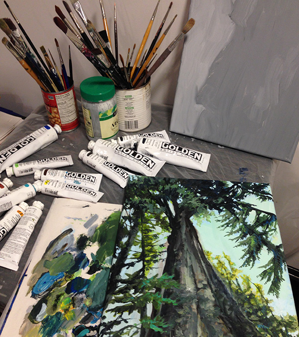
It’s strange to come back to physically painting from digital painting. No undo, no colour adjustments, fixed colour palette, no layers, no liquify tool – except, perhaps, with actual liquids. The parameters on all the brushes are fixed, and the damn stuff dries. It’s bizarre, how can anyone stand these limitations?
And yet.
You get, for free, a ton of texture. Drop almost anything onto that canvas, and so long as you commit to it, you can get texture that’s interesting to look at all on its own. Or just poke it with your finger, or with a stick, or drop some water on there and swirl it around; the methods of manipulating the form are multitude! There are no rules! And once you start embracing this rather than fighting it, well, you’re a painter now!
从数字绘画转回到实体绘画并非一帆风顺。没有撤销,没有色调调整,只有固定的调色盘,没有图层,没有液化工具————直接用真的液体了。笔刷的参数也没办法调,而且最可恶的是所有的东西都会变干。太奇怪了,有谁能受得了这啊?
但是,
你可以凭空获得数以吨计的纹理细节。只要你能坚持下来,随便往画布上涂点什么,就能自动形成有趣的纹理。你也可以直接上手,或者用一根小棍,抑或是滴点水在上面,并旋转着涂抹一下;有无数种办法可以调整画作的形态,没有任何的限制。一旦你停止与其对抗,并最终接纳这种方法,你,就成为了一个画家。
It turns out that knowledge and techniques I’ve developed digitally can be applied here, particularly that of composition and use of colour (though I’m still fighting with paint mixing; there’s a hidden parameter of pigment strength in additional to actual hue/shade/saturation and volume of paint that you simply have to get an intuitive feel for). Also, physically I can’t use the digital cheats that feel like I’m getting a nice effect quickly but are in fact crutches- smooth digital airbrushing, colour dodge, colour correction in post, gradients, sharpen (though in defense of these, I think they can be useful tools if used with consideration and restraint). I am forced to consider how to achieve the ends that are behind these special effects and then work for them directly and consciously; it makes me appreciate what they’re actually doing and when they should be used all the more.
事实证明,我在数字绘画中积累的一些知识和技巧,尤其是关于色彩组合和应用方面的技术,仍然可以在这里应用(但是我还是在头疼怎么调颜色,因为对于现实中的颜料来说,除了像色调/暗度/饱和度以及用量这些可以直观感受的参数外,还有颜料强度这种隐藏参数)。而且,现实中,我也用不了那些让你产生“我画的又快又好”错觉的作弊工具:例如流畅的数字喷枪、减淡工具、后期调色、渐变和锐化(讲道理,在深思熟虑后有限的使用的前提下,这些都是很好的工具)。这迫使我去了解这些工具背后的实现细节,并有意识地去找寻能直接达到类似效果的方法;令人欣慰的是,这让我更加了解它们的实际工作原理,并且更加清楚应何时使用这些工具。
All of this together makes me think about my digital technique from angles I hadn’t previously considered. Here’s the thing: I did not know how to paint digitally after graduating art school. It was something I had to learn using the “eye” I had developed in art school- but I had no technique. So I’m finding that adding the experience of painting with physical media, again, back on top of over a decade of digital art creation- wow, this is making new connections in my brain! It compels me to figure out how to produce the lively texture of physical painting in digital form. Heck, it really just plants seeds in my unconscious in developing both digital and physical painting, and makes me excited to try out new things.
所有的这些尝试,使我得以用前所未见的角度,重新审视了自己的数字绘画技巧。我意识到,当我从美术学校毕业时,我并不懂得如何进行数字绘画。这是一种我必须利用在艺术学院中培养出的“眼界”进一步学习掌握的东西,但当时我并没有掌握所需的技巧。如今,在积累了十二年的数字绘画经验后,再将我现在实体绘画体验置于其上,我脑中顿时建立了两者间的关联。这推动我去探寻如何以数字的方式,再现实体绘画所产生的生动材质感。这一切,在我的潜意识中,埋下了结合数字和实体绘画的种子,让我为尝试这些新事物而感到无比兴奋。
(Another aside: Disco Elysium blew me away with its incorporation of painterly aesthetics into a video game more successfully than anyone has done before. Also everything else. But that’s for another post.)
(说句题外话,极乐迪斯科 这款游戏真的把我惊到了,从未有人能这么成功地把绘画美学融入到一款电脑游戏里。游戏的其他方面也很不错,可以另发一篇文章了。)
Digital Brushes 数字笔刷
Let’s bring this back into the digital realm. I get occasional requests to share my workflow and techniques. I must admit, it’s not something I’ve given a lot of thought into expressing in a way that’s useful for other people, more a giant mess in my brain that I root around in to get the job done in the least time possible. Still, I’ll give a shot at talking about the actual brushes I use most often in my work, though this is only a part of what makes up my whole process.
回到数字绘画领域上来。我偶尔会收到一些请求,询问我是否能分享我的工作流程和技巧。但说实话,对于如何有效地向别人阐述这些想法,我也没什么好的主意。我所谓的工作技巧,其实更像是以尽快完成工作为核心的一团乱麻。尽管如此,作为整个工作流程的一部分,我还是会介绍一下我在工作中最常使用的一些笔刷。
I paint in Photoshop. Mostly out of habit, inertia, call it what you will. I don’t love where Adobe is trying to take the product (into a rent-seeking, ubiquitously intrusive cloud product-family brought to you by a subsidiary of the Tri-Tachyon Corporation), and I loathe the experience of upgrading to new iterations of the software.
Still, it’s home.
出于我个人养成的习惯,Photoshop是我画画用的软件。我不太喜欢Adobe给它们的产品所定的发展方向(就像速子科技某个子公司弄的,那种基于订阅的、无孔不入的云产品系列一样),并且我也不喜欢升级软件带来的体验。
尽管如此,我还是用PS。
I’m told Clip Studio Paint is a good alternative. I’ll have to learn it one of these days.
有人告诉我说,Clip Studio Paint是个挺好的PS替代品,我这两天有空会学一下。
A few very simple brushes form the core of my toolset, probably due to habits I inherited by the ink drawing I did all through highschool and college.
接下来,介绍几款作为我主力工具的简单笔刷,继承了我高中和大学用水性笔画画的习惯。
David 4px round 自用4px圆笔刷
本文作者dgbaumgart真名David,下文所有“大卫笔刷”,“自用笔刷”均为作者自制笔刷。
This is the one. The one brush I use as a base for everything else I do. It’s the digital equivalent of this exact UniBall pen:
这是我最重要的笔刷。这个笔刷是我画其它所有东西的基础,基本上是这种三菱UB水性笔的数字复刻。
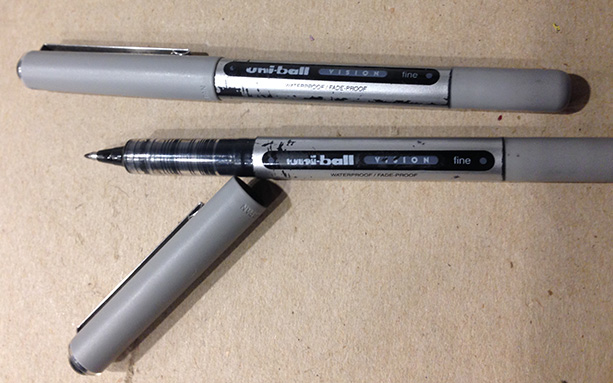
I’ve been writing and drawing with these for over 20 years. I always have a bunch of them. They’re right for me. Spiritually. (They also explode if you take them on airplanes, so don’t do that.)
My default brush is a 4px circle because that’s the smallest you can go and still have the ‘texture’ brush setting effect not make the line disappear. And you can get to almost one-pixel level detail. And because I’m an obsessive (albeit lazy) detailer, that’s what I want.
我用这种笔来日常写字和绘图大约已经有20年了,并且总是储备着很多同样的笔。他们是我精神上的最优选择。(如果带着这种笔去坐飞机,笔会炸掉,所以不要这么干。)
我PS里用的默认笔刷是4px的圆形笔刷,这是因为4px是你可以在不让线条消失情况下,能够设置笔刷纹理的最小大小。并且用这种设置,你可以得到近似于单像素级别的细节。作为一个(很懒的)细节控,这就是我要的效果。
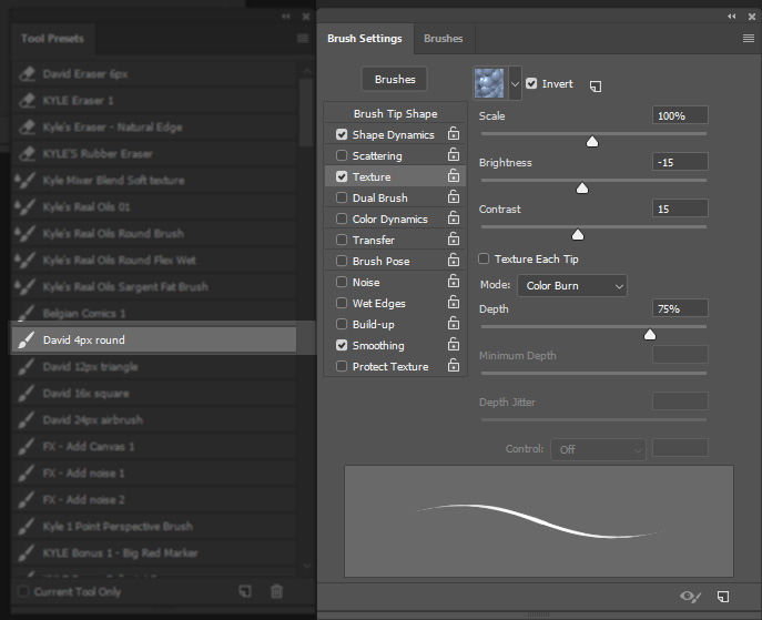
I use that ridiculous legacy bubble texture to essentially sharpen the edges of the brush and give it a bit of sharpness. It’s a truly dumb texture, but it works for what I need it to do.
This is the linework brush for sure, though I also use it to paint small details. I’ll even use it to blend because I’m crazy like that (though some of the brushes mentioned below are better for this sort of thing). When blending it pays to size the brush up a bit- 6px maybe, or more, depending on how much space there is to cover. The limitation here is that it doesn’t have a great deal of texture to it, and you’ll notice this especially when you start going to larger sizes. So we need more than just this one brush.
通过使用这种上古气泡笔刷纹理,可以使笔刷的边缘变得更加锋利,并给其本身更高的锐度。我知道这个材质真的有点傻,但是足以满足我的需要。
这个笔刷一般是用来勾线的,但我也用它来画一些小细节。我有时候甚至用它来混色,因为我贼喜欢这么干(虽然下面提到的一些笔刷更适合于此)。当用来混色时,取决于需要混合的区域大小,可以将笔刷调整到6px甚至更大。这个笔刷的局限在于,其本身并没有出众的纹理。这一局限在较大的尺寸下变得更加明显,这就是为什么我还需要其它的笔刷。
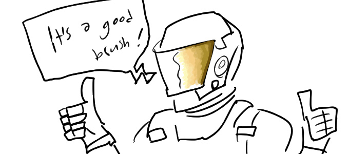
A note: Beware the tyranny of linework! If you think only in lines that get coloured in later as a separate platonic act, then you’ve limited your range. (Or you’re expressing a valid style; whatever. I’m speaking for myself here.)
一则忠告:在勾线时不要光想着那些以后会用来上色的线条,这会限制你的发挥。(当然也可以说是一种风格,不过在本文中以我的看法为主)
The next four brushes are these:
- Kyle Belgian Comics
- David 12px triangle
- David 16x square
- David 24px airbrush
接下来的四种笔刷是:
- Kyle比利时漫画
- David 12px三角
- David 16px方形
- David 24px喷枪
These are all very simple shapes, nothing all that special going on in the brush settings. The fun really comes in using them with a variable pressure pen with the Wacom tablet, and then in altering opacity.
这些笔刷的形状都非常简单,笔刷设置里也没什么可调的东西。使用这些笔刷的真正乐趣,来自于将带压感的笔和Wacom的板子一起用,并调成各种不同的透明度。
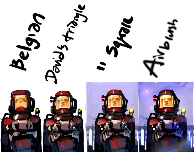
(Strong Lego spaceman energy here.)
(乐高太空人既视感)
The Kyle Belgian Comics brush is basically a 30px hard triangle brush- sure I’m jumping ahead a bit by talking about the Kyle set, but I’m counting it in with the simple brushes because it’s fundamentally simple. It’s great for laying down linework and brushwork that has some nice character to it. 30px is a bit too big for most of what I do, so I made my own version at 12px. But it’s the same idea.
虽然一开始就讲 Kyle系列 的笔刷可能有点超前,但是因为这款笔刷足够简洁,所以我也把它算进了简单的笔刷里面。Kyle比利时漫画笔刷 基本上可以看作是一个30px的三角形硬笔刷,非常适用于勾线和笔绘。30px的笔刷大小对我所画的大部分东西来说有些太大,所以我做了一个12px大小的自用版本,但设计理念上是一样的。
The square brush is the same thing but a square. It doesn’t do much in this example image, but the square is especially useful to block out artificial environments or just do brushwork with a different character or texture vs. the triangle (though the triangle is perhaps better for natural forms).
而下一个自用方形笔刷与前者的唯一区别就是形状。虽然在这幅样例中没能充分展现出来,但是其实很适合用来营造人造环境的氛围。当然,也可以仅仅被用来在笔绘过程中提供不同于三角笔刷的纹理和特性(三角笔刷其实更适用于绘制自然界中的物体)。
A note on my use of the brush here: as I’ve discussed in a previous post here (a long time ago), I keep my left hand on the keyboard to control opacity, and will turn it up or down as needed while painting. I can also hit “alt” to switch to the eyedropper tool to pull a colour out of the image to paint with. Using these together, I can hand-blend using these sharp geometric brushes to produce a blend with a lot more character than a flat gradient, like so:
关于使用笔刷的小贴士:就像我在上一篇文章(很久以前)所说的那样,在作画过程中,我一直将左手放在键盘上,根据需要来调节笔刷不透明度。这样也方便我摁alt键切换到吸管工具来从画作上选取颜色。结合以上技巧,我可以用这些尖锐的几何形状笔刷,手工绘制出比单纯的平滑渐变更富细节的颜色混合,如下所示:

The (cursed) airbrush I use mostly for effects and adjustment, and this is probably definitely the cheesiest of the bunch because it creates a boring flat round gradient. Still, sometimes I just need to pop a bit of colour dodge on a point light – this comes up a lot in scifi scenes – or drop just a bit of shadow in that corner, or smooth out the skin on a portrait’s cheek, or add a touch of all-over atmospheric shading. I’ll use this brush at wildly different sizes, over huge areas, and especially in conjunction with a marquee or mask. If you’re dropping boring smooth circles everywhere (as I did above), you’re losing a lot of good opportunities for texture, and the perfect smoothness will draw attention to other visual noise and make it look like errors rather than texture.
我那(被诅咒的)自用喷枪可能是这一些列笔刷中最掉价的,主要是因为其无聊的正圆形渐变效果,我一般用它来表现特殊效果或是进行调整。尽管如此,在某些时候我仍然需要使用这个笔刷;例如在科幻场景中,需要频繁地在点光源周围绘制些许减淡效果;其它例子包括需要在某个角落丢下一点阴影,或是让角色画像的脸颊变得更加平滑,抑或是为整幅画添加一点大气阴影效果。我在画面中大面积地应用不同尺寸的喷枪效果,并通常配合选区和蒙版一同使用。但是,如果滥用喷枪,在画面上留下四散的平滑圆形,那么您就错失了产生大量纹理细节的机会。同时,过于完美的平滑度也会凸显出画面上其他的视觉噪声,而其本身与其说是纹理,更像是某种创作失误。
If it sounds like this is a guilty admission to using this brush, that’s because that’s what this is. I still do it. But there are better ways to achieve most of the same effects. Let’s talk about them!
虽然这段话看起来像是使用喷枪的悔过书,但事实如此。虽然我现在还在用这个笔刷,但对于大部分的效果,都有更好的解决方案,这也是我接下来要说的内容。
As for painterly brushes, I’m all-in on Kyle’s Brushes.
It looks like Adobe bought his work up at some point in the past couple years, so I guess they’re in Photoshop now? I’m still using the set I got from him directly, so I can’t comment on what they’re like now if they’ve changed. The principles at work remain.
至于绘画用的笔刷,我只用 Kyle 的笔刷系列。
据说几年前Adobe已经把他做的所有笔刷都买下来了,所以我估计现在的PS里也已经有了。我手头的笔刷是直接从他那里买的,所以也不好说现在这些笔刷有了什么变化。仍然保持着我工作的原则。
Anyway, here are my favourites:
- Kyle Real Oils Round Flex Wet
- Kyle’s Paintbox Fat Fun Spongy
- Kyle’s Paintbox Big Wide Softy
- Kyle’s Paint Box Rough Dry Fun Big
You can see examples of their use in the list order:
不说了,以下是几个我偏爱的笔刷(注:翻出来太奇怪所以不翻了):
下图依次展示了笔刷的效果:
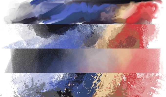
The 1. Oils Round Flex Wet is great for blending with a strong impression of brush strokes. It’s even pretty decent for just laying out swathes of colour, and has that fun slop-paint-everywhere quality to it.
第一个 “Oils Round Flex Wet” 笔刷非常适合需要强烈印痕和笔触感的情况,甚至对于绘制色样来说也很不错。其本身也有那种有趣的,遍布着黏糊糊颜料的泥泞质感。
The next two brushes are good alternatives to the airbrush because they do a similar job, but with texture.
The 2. Fat Fun Spongy gives a nice grain without being too sharp or noisy while the 3. Big Wide Softy is an even more subtle version of the same, with just a touch of noise to keep things interesting- this is definitely a “fill in the sky” or “atmospheric shading” sort of brush that should be used instead of that simple airbrush.
接下来两款笔刷是喷枪的理想替代品,有着同样的功能,但比喷枪拥有更多的材质纹理。
第二款笔刷 “Fat Fun Spongy” 有着恰到好处的颗粒感,不显得过于尖锐或粗糙;而第三款“Big Wide Softy” 则是第二款笔刷的小颗粒版本,略微带有一些噪点以帮助保留细节。在进行类似于给天空上色或表现大气阴影的工作时,这种笔刷比那些单调的喷枪要强得多。
Last, we’ve got 4. Rough Dry Fun Big. This is the most punk rock of the brushes. It doesn’t care what you think; it’s edgy, high-contrast, and in-your-face. Absolutely wonderful for roughing things up, and, like all of the brushes here, can be used at a lower opacity to rough things up a little more lightly.
最后一个要介绍的笔刷是 Rough Dry Fun Big,是这一套笔刷中最为朋克和硬核的笔刷。这个笔刷完全不在意你的想法,直接把高对比度的锋利笔划糊到你脸上,绝对很适合用来给画作添加粗糙的质感。和以上介绍的几款笔刷一样,可以通过调低不透明度的方法,来控制粗糙化的程度。
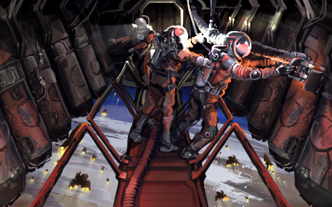
Now that I’ve told you about it, I bet you can see where I used the Rough Dry Fun Big in the above illustration in a couple different places. And look again at the images I opened the post with, you should be able to identify most of these tools in play.
现在我已经把我自用的几款笔刷介绍给你了,如果你仔细观察上面的几幅画作,你应该能发现我在几个不同的地方使用了 Rough Dry Fun Big 这个笔刷。如果你再回去看看开篇的几幅画作,对于我介绍的这些工具,你也应该能分辨出其中的绝大部分。
How about one more thought on composition and artistic interpretation?
Here’s a game asset for a thingy you will be able to find around certain star(s):
让我们来思考一下构图和艺术诠释中的另一个问题,如何?
下图展示了某种设备的贴图,你可以在(未来游戏中的)某个(些)恒星附近找到它:
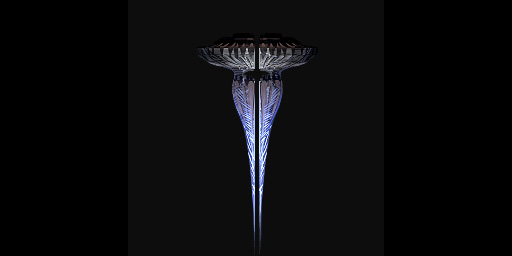
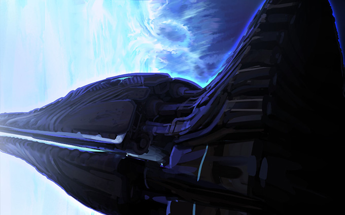
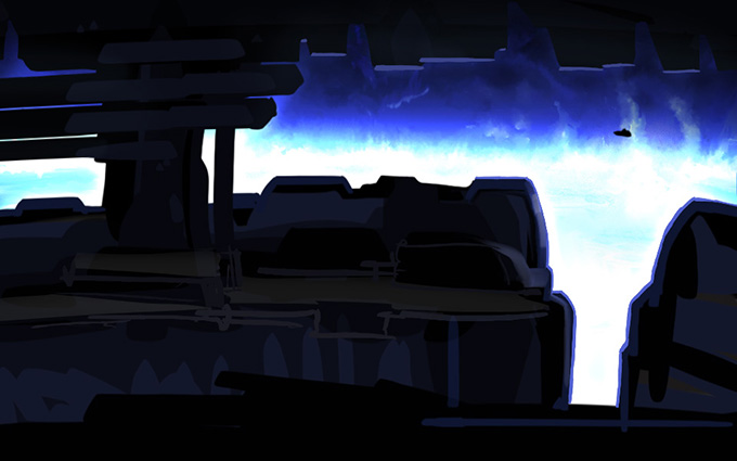
Great! A totally normal thing of little importance, probably. When you interact with it, how’s it going to look? I drew up two rough options, and by using what you’ve learned in this blog post you have to guess which composition we’re going to use for the final illustration.
好呀,大概是一个稍微有点不同寻常的东西。当玩家与之互动时,应该用哪副图作为互动界面的插图呢?以下是两种我绘制的插图选项;现在,用你阅读本文获得的知识,来猜测一下我们最终应该使用哪种构图吧!
Option 1 选项 1
Options 2 选项 2
Do you have an answer? I’ll wait.
有答案了吗?不用着急,我等着你。
.
.
.
.
.
.
.
.
.
.
It’s 2. Why? Because it’s showing you something you haven’t already seen!
Thanks for reading.
选2,为什么呢?因为在图二中,给玩家展示了他们还没见过的内容!
感谢阅读!
